Financial Wellness Interface — Concept Project
IMPORTANT: This is a fictional concept project created solely for design exploration. It is not affiliated with, endorsed by, or associated with any real company, brand or organisation — including any that may have similar names. All branding, visuals and content were created for portfolio purposes only.
Overview
Project
Designing a budgeting experience that helps users understand their spending and increase their savings.
Duration
Challenged myself to design and finish the project in just one week
Problems
While mobile apps dominate, some users still prefer a more deliberate, sit‑down approach to monthly planning, with automation layered in where it adds value.
Goals
Develop a modern, wide‑screen interface that is easy to use and engaging enough to retain users.
My role
UI/UX designer, branding and Front-end Development.
My responsibilities
Handled the full design cycle: research, wireframes, prototypes, and interface development.
Understanding User Pain Points and Crafting a Response
Not all users are inclined to use mobile apps for financial planning. Some prefer the reassurance of sitting down with a larger screen, reflecting on their monthly expenses, and planning ahead in a more structured way. I share this perspective myself, which made the challenge personally relevant. Building on this, I created personas across different but related user groups, including young professionals, families, and small business owners. I synthesised the findings into categories, identified recurring themes, and focused on the requirements that resonated with the majority. This process was guided by a full UX lifecycle, from initial research and ideation through wireframes, prototypes, and the development of a working interface. The result was a concept that balanced modern design with cultural expectations of clarity, adaptability, and trustworthiness in financial tools
The full work process
Planning began with a simple goal — to design a web‑app interface where users could comfortably track their monthly inflows and outflows. I established a sequence of milestones to ensure steady progress and deliberately constrained the project to a short timeframe, mirroring the discipline of a design sprint.
Research was centred on understanding three levels of users: the primary audience, a secondary group, and a tertiary segment. This layered approach ensured that the interface could include features appealing to a wider range of needs, rather than focusing too narrowly on one type of user. Alongside audience analysis, I explored branding and design directions to understand how visual identity and usability could work together to create a cohesive experience. To streamline the process, I also investigated how modern AI tools could support and automate parts of the research and planning stages. This allowed me to dedicate more time to the creative and problem‑solving aspects of the project, ensuring the final design was both user‑centred and efficient
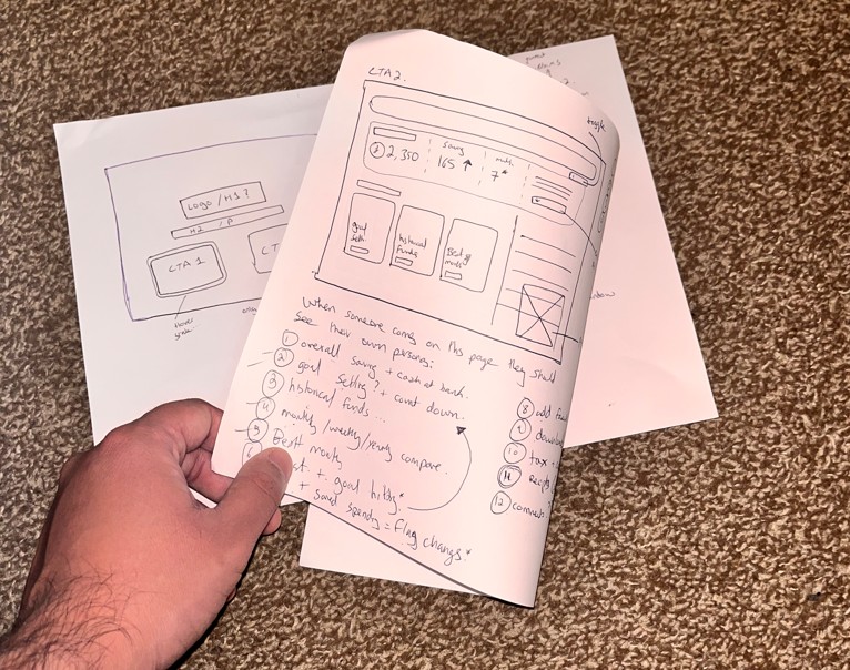
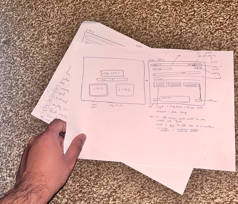
I approach implementation through a structured UX research and design lifecycle. This stage is deliberately iterative, where mistakes and revisions are not only expected but embraced as opportunities to refine and strengthen the product. By testing, adjusting, and reworking ideas early, the design evolves into a more resilient and user‑centred solution. During this phase, wireframes are developed and refined, user journeys are mapped, and personas take centre stage in guiding decisions. Visual artefacts such as cards, flows, and prototypes are organised to ensure that every design choice remains anchored to real user needs and behaviours.
Since this was a self‑initiated concept project, I also reflected on how the back‑end logic would support the interface. After defining the UX problems and outlining solutions, I considered the technical operations that would be required to make the application functional. This included thinking through how databases might be structured, how data would flow between front‑end and back‑end, and what frameworks could be used to handle tasks such as uploading, downloading, and managing user information. By mapping out these considerations early, I ensured that the design was not only visually coherent but also grounded in practical implementation logic.
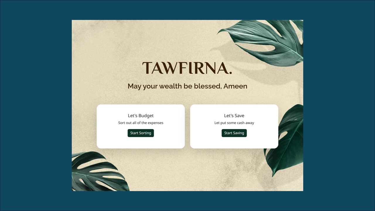
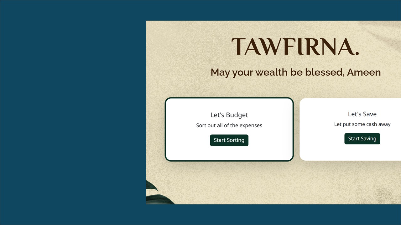
With a background in design, I placed strong emphasis on ensuring the branding was carefully considered and visually cohesive. The goal was not only to make the product functional but also aesthetically appealing. I selected a warm and inviting theme to create a sense of comfort and approachability, reinforcing the idea that financial planning can feel engaging and accessible rather than intimidating. By aligning the visual identity with the overall user experience, the branding helped establish trust and encourage users to spend time with the interface.
Once the skeleton and skin was sorted out, I imagined my UI to be the fibres holding everything together. This is where I looked into the relevant libraries and frameworks and decided on how I want the front end to look. I wanted to use modern styles, colours, and UI elements that made everything intuitive and easy to use.
Feedback is central to my design philosophy, no matter the stage of the process. It was important to carry this principle into the interface itself, ensuring that every interaction felt clear and responsive. I designed the UI so that clicks, hovers, and other actions provided immediate, intuitive feedback, helping users understand the system’s response and reinforcing a sense of control. By making these micro‑interactions obvious and consistent, the experience became more engaging, trustworthy, and user‑friendly.
One of the key lessons I took away from this project is that it’s impossible to satisfy every individual user case. Instead, it’s more effective to establish clear focus groups and user leads that represent the majority of scenarios, ensuring the solution is grounded in the most common needs. I also recognised how easy it is to get carried away with design decisions, since aesthetics are highly subjective. Maintaining discipline around wireframes proved challenging as new ideas continued to emerge, but this highlighted the importance of balancing creativity with structure. Iteration is valuable, yet keeping a strong framework helps prevent scope creep and ensures the product remains aligned with its original goals.
- Integrate more AI‑driven features to enhance automation and insights
- Create a dedicated user details/profile area
- Introduce personalisation options such as greetings (“Hello”) and theme selection
- Expand language and font support for inclusivity and accessibility
- Enable report generation and secure sharing with controlled access
- Implement real‑time API integration to keep data dynamic and up to date
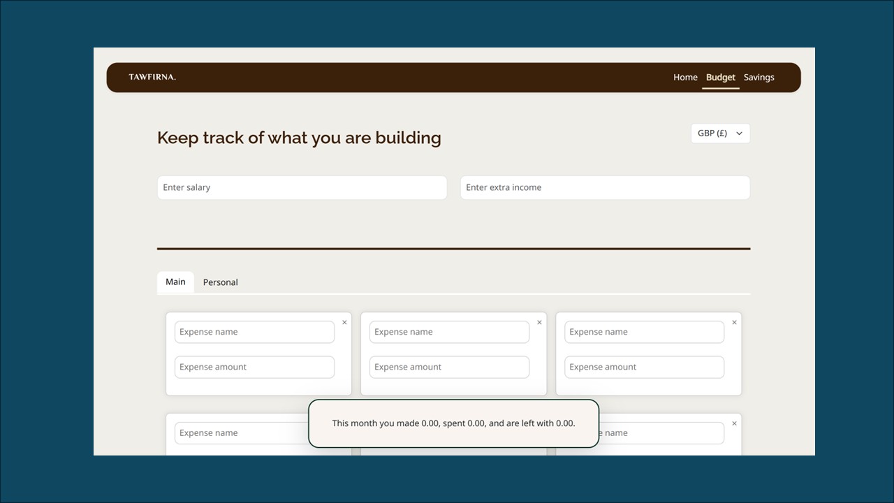
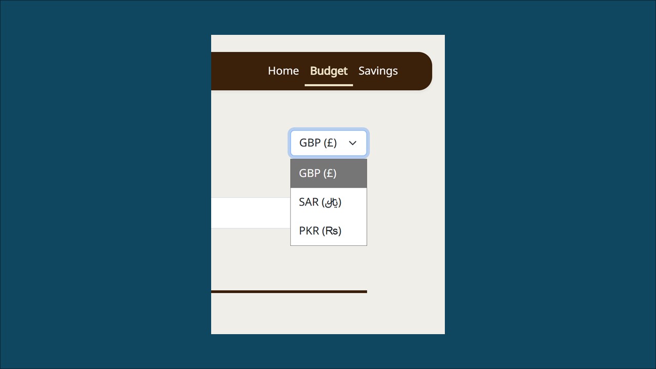
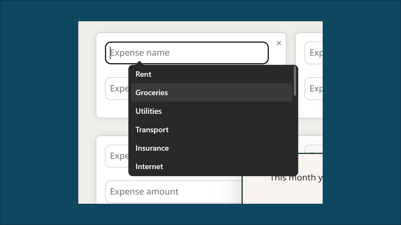
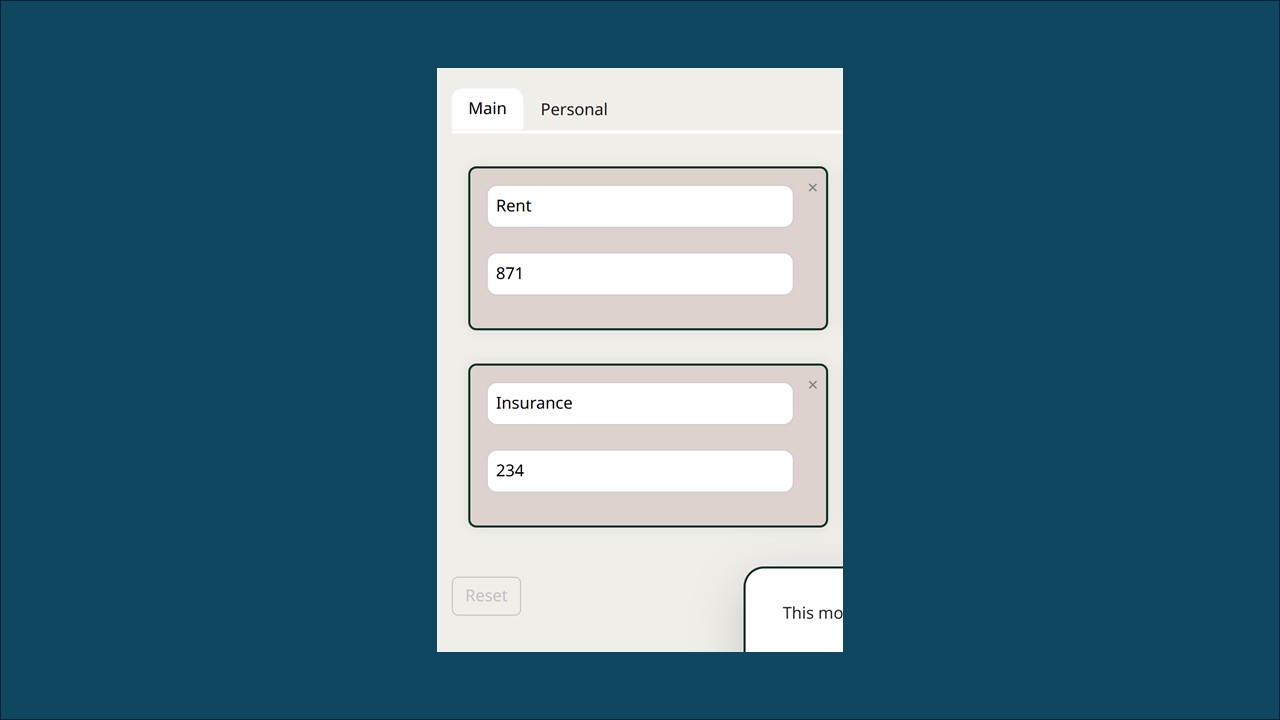
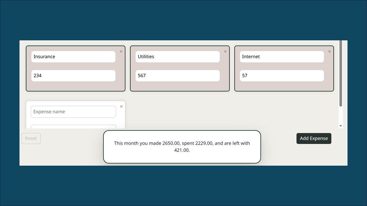
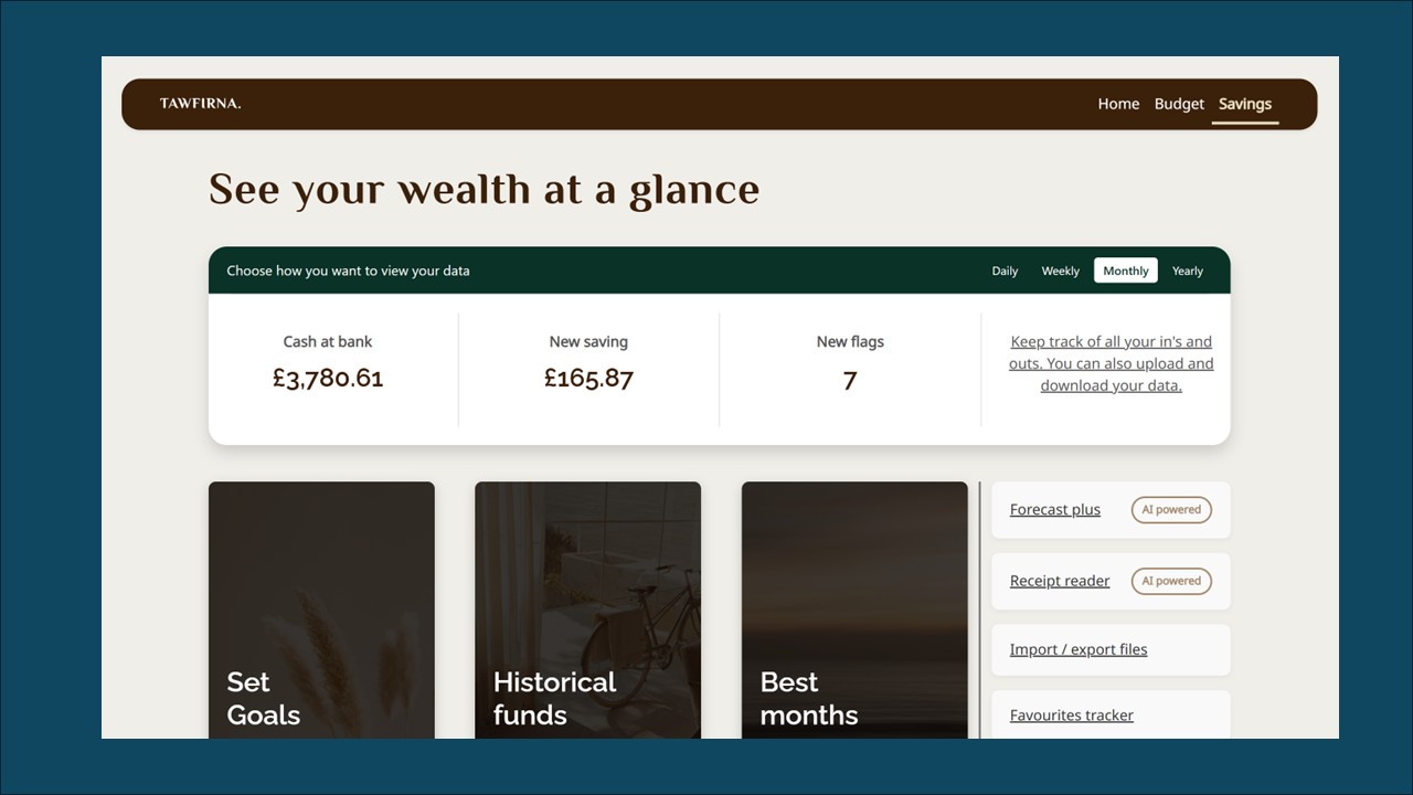
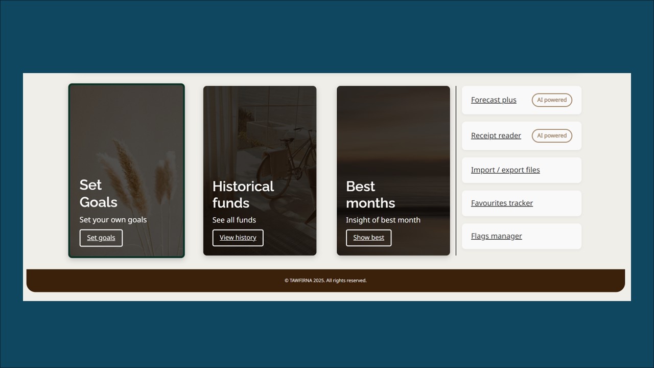
Various screen shots
Please watch the prototype above or get in touch to find out more.

Thank you!
Jump to another case study
Click on another case study to view it.


© creattaf.co.uk 2026. All rights reserved.
All trademarks, logos and brand assets are the property of their respective owners and are displayed for portfolio presentation purposes only. Contact me for more information.