IMPORTANT: This is a fictional concept project created solely for design exploration. It is not affiliated with, endorsed by, or associated with any real company, brand or organisation — including any that may have similar names. All branding, visuals and content were created for portfolio purposes only.
Overview
Project
A personalised wellness platform designed to bring calm, clarity, and structure to everyday wellbeing through AI‑guided routines and a warm, human brand.
Duration
A focused one‑week concept sprint designed to challenge my full product design workflow across UX, UI, branding, and AI integration.
Problems
Wellness apps feel overwhelming, generic, and visually noisy. Users struggle to find guidance that feels personal, trustworthy, and emotionally grounding.
Goals
Create a calm, intuitive, and personalised wellness experience powered by AI — supported by a scalable SaaS model, a cohesive brand system, and accessible design.
My role
Lead designer responsible for UX strategy, UI design, branding, AI integration, responsive layouts, design system creation, and AI art direction.
My responsibilities
Research, information architecture, wireframing, prototyping, visual design, accessibility, component library, motion direction, and collaboration with backend/API constraints.
The Challenge
Most wellbeing tools today live inside isolated, ad‑heavy mobile apps. They focus on one slice of wellness — fitness, nutrition, mindfulness, or medical records — but rarely bring everything together in a calm, unified space. Users end up juggling multiple apps, notifications, and logins just to keep track of their health.
There’s no premium, ad‑free experience that syncs seamlessly across all devices and lets you check everything that matters to your wellbeing in one place — from GP information and test results to daily focus, fitness goals, nutrition habits, and progress tracking. And when users need quick clarity, they’re often left searching through menus instead of getting instant, AI‑guided triage and support.
The Solution
Nafhanay was designed backwards — starting not with features, but with the user’s entire wellbeing journey. Every decision began with a simple question: What might someone need for their health, and on which device would they naturally reach for it? From that foundation, the experience was shaped mobile‑first, ensuring clarity, comfort, and ease no matter where the user is.
The platform is built to reduce anxiety, not add to it. When symptoms arise, Nafhanay offers a gentle, guided way to understand what’s happening and seek medical advice quickly in a world where AI can surface information instantly. Beyond triage, it supports everything else that contributes to a person’s health — fitness goals, nutrition habits, focus, test results, GP information, and daily routines — all in one calm, ad‑free ecosystem.
At its core, Nafhanay helps users get to know their bodies more deeply, both physically and spiritually. It turns complex health information into something approachable, meaningful, and easy to understand. Through thoughtful design, Nafhanay becomes a digital companion that helps people feel more connected to themselves, more informed, and more supported every day.
Design Decisions
Mobile‑First by Nature
Designed for the device people check most, with a layout that feels natural, fast, and effortless on mobile and scales beautifully across all screens.
Human‑Centric by Design
Built around real human needs, with interactions and feedback that feel warm, intuitive, and supportive in real time.
AI as a Friendly Guide
Intelligent enough to help and triage quickly, yet gentle and approachable so users feel comfortable, informed, and in control.
Accessible and Inclusive for All
Clear language, responsive layouts, voice‑friendly features, and calm visuals ensure everyone can understand and navigate their wellbeing with ease.
Branding & Art Direction
Calm, Neutral Aesthetic
Soft beiges, deep greens, gentle shadows, and a quiet‑luxury feel to reduce cognitive load.
Unified Visual Language
Consistent colour, spacing, and typography across all devices for a seamless experience.
AI‑Directed Imagery
Midjourney‑guided visuals that feel warm, faceless, and human‑centred.
Visual Tone of Voice
Every visual choice reinforces Nafhanay as a calm, reassuring wellbeing companion.
Project Summary
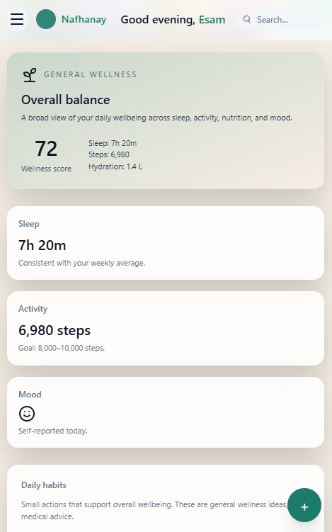
Nafhanay was designed to help people reconnect with themselves in every way possible — physically, mentally, and emotionally — no matter where they are or which device they’re using. From mobile to desktop to wearables, the experience stays calm, consistent, and always within reach. Users can check their goals, track fitness, calm their mind, review symptoms, and even begin drafting messages to their doctor in a space that feels safe and human.
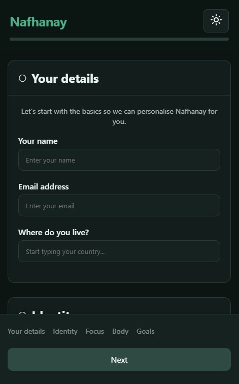
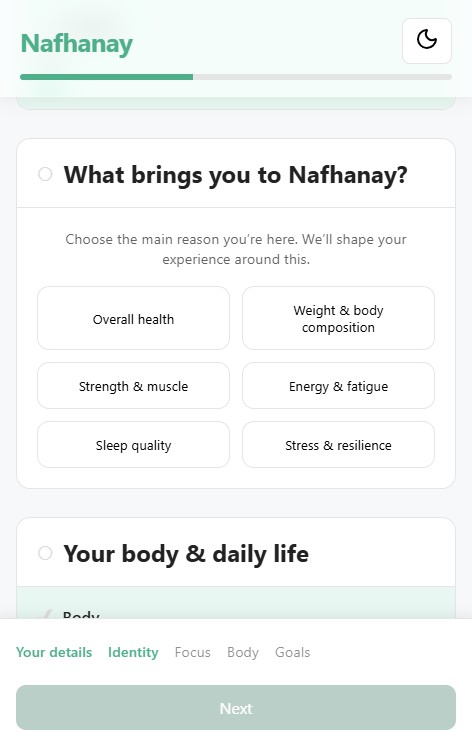
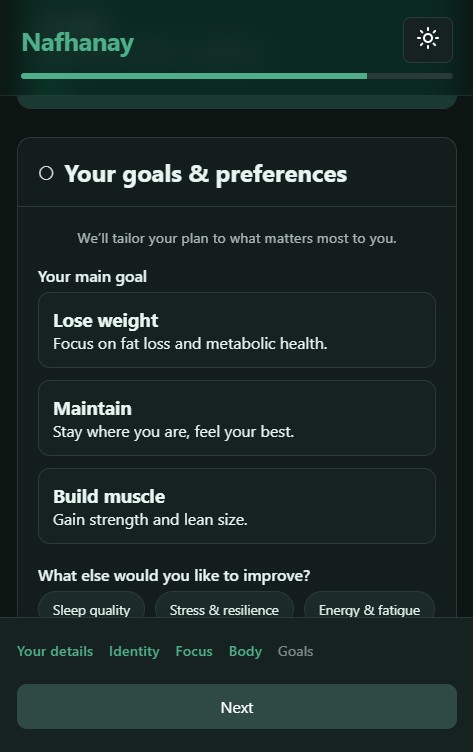
The journey begins with a premium onboarding flow that gently sets the pace. A simple, guided form learns about the user’s needs, habits, and concerns, then curates a personalised dashboard that lays out every aspect of their wellbeing in a clear, human‑friendly way. The platform adapts across devices, responds intelligently to context, and pairs seamlessly with smart tech to support daily routines.
Every interaction is intentional — from the breathing‑like motion during onboarding to the soft transitions and warm visual language throughout. AI plays a supportive role, offering clarity, triage, and guidance without ever feeling clinical or overwhelming.
Nafhanay is a fully self‑directed concept: branding, art direction, UX, UI, motion, and code were all crafted by me to explore what a truly unified, human‑centred wellbeing platform could feel like.
All trademarks, logos and brand assets are the property of their respective owners and are displayed for portfolio presentation purposes only. Contact me for more information.